
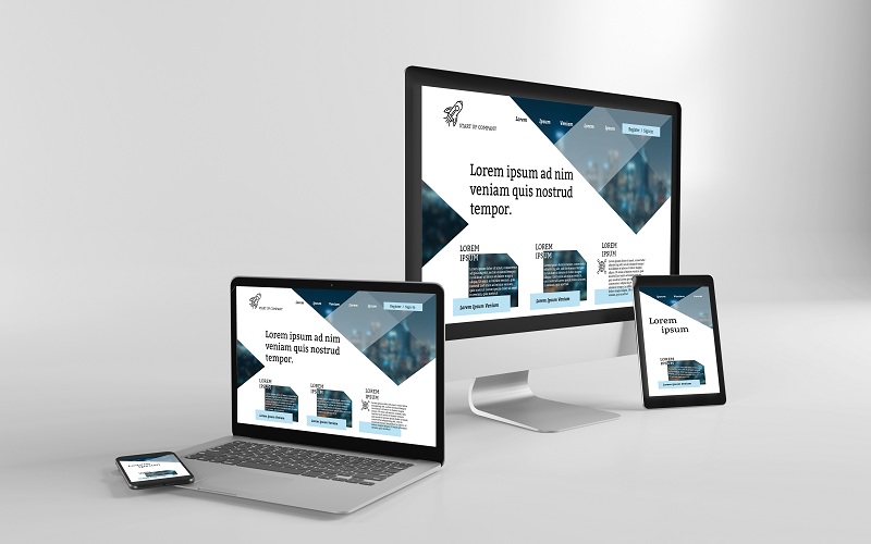
Gone are the days of designing a website for a single desktop screen. Considering that people use varied devices to access the internet, it is practically essential to design websites that keep up with the millions of screens out there. Thankfully, technology has evolved to propose a great way to make sure content is displayed correctly on different resolutions using responsive web design.
Essentially, a responsive web design means that your web design automatically adjusts for different screens sizes and viewports.
In this post, you will find everything you need to know about responsive web design and how you can use it to make your website SEO friendly.
What is Responsive Web Design?
At its core, responsive web design (RWD) refers to a modern web designing approach that suggests creating websites whose display automatically adapts to the user’s screen. In other words, responsive web design is all about designing and developing a website such that its contents automatically changes to fit multiple screen sizes and browsing conditions.
To create a responsive website, designers use flexible grids and layouts, size elements in relative units, and intelligently apply CSS media queries. Ultimately, this gives a design that can automatically adapt to the user’s behaviour, depending on screen size, platform, and orientation.
Responsive websites deliver the best experience to users by ensuring that websites and web pages are successfully viewable on all devices.
How does responsive web design work?
Responsive web design uses so-called breakpoints to determine how the layout of a website will appear. It works through CSS to serve different style properties and characteristics of the user’s device, including the screen size, orientation, resolution, and colour capability.
In responsive design, the same HTML is served to all devices, and a single codebase is used to support users with differently sized viewports, where elements reshuffle as the viewport shrinks or grows.
The technicalities of responsive designs
Responsive web design adheres to these three principles.
- Fluid grid system: It changes the size and shapes of elements depending on the width of the screen the viewer is using. The web design agency developing your website will choose where pixels should appear and define layout size so that elements scale up or down in a fixed way. For your information, it involves applying a percentage of features to the required properties in the CSS script so that you have a single design that expands and shrinks automatically.
- Flexible image and media: Images are not naturally fluid. In this regard, you need to apply a CSS command to ensure that images, videos, and other media respond to the viewer screen’s width.
- Media Queries: These are filters used to detect the dimension of the browsing device and adjust the design accordingly.
If you're a beginner trying to make your website responsive, the good news is that you don’t need to have programming expertise to create a responsive design. There are various handy tools that you can use to achieve a responsive design. Alternatively, if you do not feel up to the challenge and your budget allows, a web design melbourne agency, or agency in your location, can help and do the work for you; allowing you to concentrate on other areas of your business.
Why is it important to have a responsive website?
Responsive web design relieves web designers, web developers, and user interface designers from the hefty work of creating websites for every single device. As such, creating a responsive website can help achieve the results you wish pretty effortlessly.
Here are reasons why you should consider having a responsive web design:
- Having one website for all devices
- Search engine optimization - Google and other search engines rank websites based on quality and relevance. As such, having responsive web design is one of the ways to make your website SEO friendly
- Large audience appeal
- Improved user experience
- Website adaptability gives you credibility and establishes you as trustworthy
- Creating a website optimized for all devices is cost-effective
Conclusion
Making the correct decision when building your website can help you achieve the most desired success with minimal hassles. Responsive web design gives internet users equal access to information regardless of the device each user is using to browse. While it is not a cure-all, it has many peaks for website owners and internet users. Hopefully, after reading this post, you found it helpful and got insights into what it is like to have a responsive web design.